Difference between revisions of "Pattern Library"
| Line 2: | Line 2: | ||
* [[Pattern_Library_Introduction|Introduction]] | * [[Pattern_Library_Introduction|Introduction]] | ||
== The Vocabulary: Pattern Components == | |||
* [[Pattern_Library_The Vocabulary: Pattern Components|The Vocabulary: Pattern Components]] | * [[Pattern_Library_The Vocabulary: Pattern Components|The Vocabulary: Pattern Components]] | ||
* [[ | |||
== The Vocabulary: User Interface Patterns for Web Applications == | |||
* [[Pattern_Library_User Interface Patterns for Web Applications|User Interface Patterns for Web Applications]] | |||
<p><font size="2" color="#000"> | <p><font size="2" color="#000"> | ||
Revision as of 13:29, 27 September 2007
Introduction[edit]
The Vocabulary: Pattern Components[edit]
The Vocabulary: User Interface Patterns for Web Applications[edit]
All graphical user interface patterns consist of a defined and well known vocabulary of so called 'user interface controls'. These basic controls are used as bricks for building any patterns. These controls derive from graphical operating systems GUI Links and handed down to the world wide web as to interact with HTML pages. The following sections show all commonly used controls of todays web applications.
Apart from desktop applications these 'user interface controls' are implemented in web applications in numerous forms. e.g. a button can be a table with a hyperlink as well as a text with background colour or an image.
Organizing Layout and Display[edit]
- Scrollbars
- Text (Labels/Messages)
In web applications the use of text is different compared to web sites. Whereas web sites are designed for display of content, web applications use text mostly to distinguish interface components (Labels) or interact with the user (Messages). Users do not read text but scan through the lines in order to find keywords. The size of Text depends on the age of the user and would be scalable on demand via the style sheet.
- Rectangles
Rectangles are very fundamental elements and therefore not taken into consideration consciously. As applications can populate the screen layout very flexible the layout often becomes very inconsistently for human perception. Rectangles group or separate elements to make clear which components work together. Rectangles are especially useful in improving usability of long and monotonous pages with many form fields.
A rectangle can also be used as a placeholder. A placeholder creates space and prepares the user to expect system output. Using a placeholder does make the application behave more predictable and static. The layout does not change when an empty area is populated. Rectangles appear as borders, background colors or just empty space.
- Tables
Tables as html tags are not recommended anymore to be used for organizing the layout. Tables should only be used to list structured data.
Images
Images are used as part of content or as part of the application (Icons).
User Input[edit]
Text Fields
Text fields are used to take up input values from the user and hand it over to the system for further processing. A text field should have a label, with a description applied. The label is placed on top of the box, aligned left to be scanned fast.
Text Area
Text areas are used to take up whole phrases from the user. A text area should have a label with a description applied. The label is placed on top of the box, aligned left to be scanned fast.
To prevent users from typing on the last line, line padding should be applied.
Trigger Actions[edit]
Buttons
Buttons are widely accepted as a call for user interaction. A button is used to trigger application functionality, to submit user input and to accept or chancel dialogs.
- All buttons should appear on one screen without the need of scrolling
- A standard button style is recommended
- Form and size should not be similar to banners (banner blindness)
- The button text must be meaningful according to the users terminology
- Buttons behave different from links (A link always leads to another page)
Hyperlinks
A hyperlink usually is blue and underlined. Users are already familiar with other colours. Hyperlink must in any case be underlined. When hovering the browser specific indicator must always be retained unchanged an never turned off.
Icons
See 'Images'.
Choosing Options[edit]
Drop Down Boxes
Similar to a vertical menu. The frequent user of these boxes is not recommended because options can only be seen after a click. Drop down boxes can submit any selection after the choice is made ore make use of additional submit buttons. Drop down boxes can also allow multiple selections.
Combo Boxes
Similar to the drop down. The combo box is different in the way that it allows to enter text on the first line.
List Boxes
List boxes can carry a large amount of options. More than one selection can be made by pressing the CTRL key. The list box is rarely used, because users have to change from mouse to keypad to press (and hold) the CTRL key.
Radio Buttons
Radio Buttons are used where several options must be applied and the user can only choose one of them. One Option is usually predefined by default.
Checkboxes
Radio Buttons are used where several options must be applied and the user can choose more than one of them or none. None is usually predefined by default.
User Interface Patterns for Web Applications[edit]
Organizing Layout and Display[edit]
In Work ...
User Input[edit]
In Work ...
[edit]
In Work ...
Browsing Data[edit]
In Work ...
Display Data[edit]
Display many items (Item Lists)


A list of items provides the user with an option to get an overview on records. Relevant items can be identified and selected. To distinguish relevant items metadata is displayed. The more metadata is shown the less items can be displayed at once. Any list display has to balance metadata display and the number of items displayed
List displays provide the following set of patterns:
- A list header
- A paginator
- A list body with sorted Items and their metadata
- An action menu (if items can be manipulated)
- Selection handles (if items can be manipulated)
List header, paginator and action menu can appear repeatedly on top and bottom of the list display because such lists can exceed the display area. If items on a list can be manipulated, the list display contains an action menu and selection handles additionally. Within this document a 'list of items' means all records retrieved. The term 'page' only refers to all visible items in the browser window.
The Pattern 'List Header'[edit]
Every list should provide functions to help organizing it in a convenient way like sorting, display options or a hit counter. This can be done by a list header. The list header appears as a horizontal bar above the list.
Which Scenario fits?
Many items have to be displayed exceeding one single page. The items can not be shown in a table using columns and rows. The user is expected to look up items by one or more important criteria and might want to select single items from the list.
How does it work?
The header has the following controls applied:
- Multiselect
If the list provides selection handles, please consider a control to select all items above them on the left side. For long lists of items it is necessary to do inverse selection. When using the control, the user has to be aware what is meant by 'all': 'All within one page' or 'all within the whole result set'. If selected items can even be deleted, this is a major source of data loss. If a selection spans the hole item list a counter will be of great help. Since the users usually is occupied with rating items by importance he can not keep track how many items have been selected after working on different pages of the list.
- Counter
A counter has to provide the total number of records received and the number of records selected. The counter can be placed on the left of the list header. It gives a first impression to the user in how specific his search was.
- Sorting
In many cases lists of items are used to pick one or more of the first relevant records standing on top of the list. Sorting is the most important technique to refine a list of records. Sometimes it is not sufficient to see the list sorted by one criteria only. In case the list is a good match but has still too many items, especially scientific users should have an option to sort by alternative criteria (e.g. date of publication in print, genre, ...).
Sorting is recommended to work cascading. If a list is sorted by date it makes sense to sort within equal dates by the last chosen criteria or the next criteria of relevance. This allows to refine a result list properly.
- Display
Display options provide a way to make the appearance of items applicable to the needs of rating items. A short display might be enough to rate an item by its first five metadata entries. If items must be rated by more specific metadata (Abstract, ToC, Source), it is necessary to switch to a more detailed view. Even if the user likes to compare various selected items. Two or three display formats should be prepared, ordered by the most relevant metadata.
Pros and cons
- + layout consistency
- + common usage
- + separation of page navigation and list properties
- - less flexible usage of space
- - overhead when only view items are displayed
Varieties and Examples
- paginator as part of list header
- more lines
- different controls for sorting
- enriched with further functions (Export, Modify,...)

The Pattern 'Paginator'[edit]
List display exceeding more than one page need to be browsed by the user. Paging functionality is essential to access any list of records. Users must know how many pages are available, what page is currently displayed and how many items are on one page (if the page exceeds the bottom of the screen). In short, the paginator is to provide the user with the ability to jump as fast as possible to any page within the list.
Which Scenario fits?
Many items have to be displayed so that they exceed a single page. The user wants to see items on another page or leap some pages ahead to see if relevant items can still be found. Items must be selected, spanning more than one page. The selection of items must be refined or revised across different pages.
How does it work?
Common paginators make use of the metaphors used to playback media content (rewind/pause/stop/play/forward). The following options are recommended and ordered as following:
- jump to first page
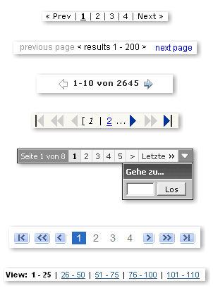
- display last back
- display next page
- jump to last page
- jump to a given page number
- specify the number of items displayed on a single page

Operating the paginator shall not have influence on selections and display properties.
Pros and cons
- + standardized handling of lists
- + common usage
- + separation of page navigation and list properties
- - less flexible usage of space
- - overhead when only view items are displayed
Varieties and Examples
- paginator as part of list header
- more lines
- different controls for sorting
- enriched with further functions (Export, Modify,...)
The Patterns 'List Body'[edit]
The list body is populated by the content itself called items. The layout structure of the list body depends on the type of media displayed. If the content is of type 'text' it would be build up of paragraphs (see Google). If the content is of type values a table can be applied. If the content is of type picture/sound a thumbnail followed with a table like layout appears suggesting.
Different ..


Links[edit]
See also Yahoo!s design pattern library