|
|
| (33 intermediate revisions by 4 users not shown) |
| Line 1: |
Line 1: |
| <accesscontrol>MPDL,,</accesscontrol>
| | {{Template:TemplateUIE_Activities}} |
| {{Template:TemplatePatternLibrary}} | | <div style="float:left; width:70%; margin-bottom:3em;"> |
|
| |
|
| =Application Layout= | | ==Look and Feel== |
| | |
| eSciDoc applications (starting with PubMan R4) will appear in a new application layout. The common layout is based on a horizontal menu set, see
| |
| [[Pattern_Library/Navigating_Functionality#Menu_Sets| Menu Sets]].
| |
| | |
| [[Image:Application_Layout.gif|center|Areas]]
| |
| | |
| ==Header Section==
| |
| | |
| The header contains all persistent elements. A short header is still not defined as a component for R4 (used in FACES and VIRR based on GUI 1.8).
| |
| | |
| '''Component: Skip Link Navigation'''
| |
| | |
| Used to meet [[GUI Accessibility|accessibility requirements]].
| |
| | |
| '''Component: The Meta Menu and the logo alternate'''
| |
| | |
| It is a horizontal, [[Pattern_Library/Navigating_Functionality#Menu_Categories|persistent menu]] which did not change, except in colours and style compared to GUI V1.8. As some Solutions already make use of a short header there is a second component (short header).
| |
| | |
| In addition to the logo there is a possibility to change/add graphical details to the logo (Seasonal stuff).
| |
| | |
| '''Component: The Search Menu and the Logo'''
| |
| | |
| The eSciDoc project logo is placed here, and can be customized using [https://zim01.gwdg.de/repos/smc/trunk/04_Design/03_GUI_Design/03_interface_development/eSciDoc_Component_Library/index.html LAYER 3 - the vendor specific CSS] with:
| |
| | |
| *Varieties of solution specific logos
| |
| *Institute related logos
| |
| *Logos in combination with visuals
| |
| | |
| Simple search did not change, except in colours and style compared to GUI V1.8.
| |
| | |
| '''Component: Main Menu'''
| |
| | |
| It is a horizontal, [[Pattern_Library/Navigating_Functionality#Menu_Categories|persistent menu]] replacing the main menu of GUI V1.8. The main menu has one level and does not change within one workspace. This is sufficient for all roles and existing functionality.
| |
| | |
| ==Content Section== | |
| | |
| The content area contains all content and related actions or information.
| |
|
| |
|
| '''Action Menu/Content Menu'''
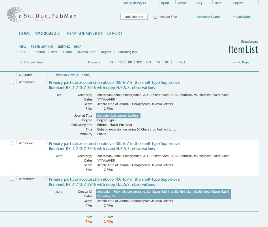
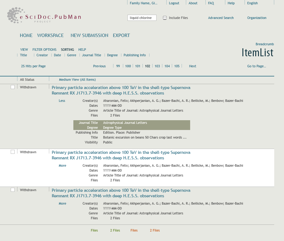
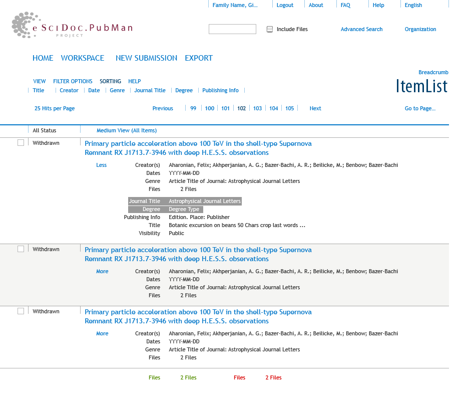
| | GUI V2 offers arbitrary color schemes<ref>[http://en.wikipedia.org/wiki/Color_scheme Wikipedia article on color schemes]</ref>. One scheme is set as default but users can choose their own scheme out of three varieties. Each scheme derives from the color definition, documented in the [[GUI Style Guide |Style Guide]]. To cover a large scope, schemes range from cold to warm colors. |
|
| |
|
| The sub menu is not necessarily a second level of the main menu. It is a [[Pattern_Library/Navigating_Functionality#Menu_Categories|temporary menu]], depending on user role and the current page displayed (e.g. Sorting, Display type, ...). If necessary the menu can offer two levels.
| | Please keep in mind that colors appear differently across media type, display devices, browsers and system settings. Although each scheme is balanced carefully with propper corresponding colors it might not meet the intention on a specific display. Therefore one of the schemes is optimized towards contrast. |
|
| |
|
| '''Breadcrumb'''
| | If necessary more schemes can be prepared for later releases or individually be defined by the institute with the help of the UIE Team. The default scheme is chosen together with pilots and early adopters and will appear after starting the application. |
|
| |
|
| Dependent on the outcome of [[Interface_Draft:_Breadcrumb_Concept|breadcrumb concept]] the area is offered here.
| | ==Color scheme 1 (blue)== |
|
| |
|
| '''Title'''
| | [[Image:blue_style.png|center|framed|275px|Example of the new look and feel]] |
|
| |
|
| The title is similar to the title used in GUI V1.8. It is not used to display metadata like item title, genre or physical page names. It contains short and clear names of functional areas, meaningful to the user.
| |
|
| |
| '''WS'''
| |
|
| |
| Role dependent eSciDoc components do appear differently depending on roles. The content area therefore has an exclusive part for workspace related elements (e.g. Item status). Any components that contain WS relevant elements should make use of these areas if possible.
| |
|
| |
| '''Main Content'''
| |
|
| |
| e.g. Items, Lists, ...
| |
|
| |
| ==Public Repository==
| |
|
| |
| The public repository does not show areas defined for workspaces.
| |
|
| |
| [[Image:Public_Repository.gif|center|framed|The public repository]]
| |
|
| |
| ==Workspaces==
| |
|
| |
| After a user has logged in to the system, a starting page with existing workspaces will appear. The start page informs the user:
| |
|
| |
| *What role he is in
| |
| *What can be done with the priviledges of the role
| |
| *Any other roles PubMan offers
| |
|
| |
| At this point in time the menus change and all functionality is available. If possible the user should be able to decide if the page is always shown after login or on demand.
| |
|
| |
| [[Image:Workspace_StartPage.gif|center|framed|The workspace starting point]]
| |
|
| |
| From the workplace start page the user enters his workspace and gets additional areas (e.g. Item Status)
| |
|
| |
| [[Image:Workspaces.gif|center|framed|Workspace Areas]]
| |
|
| |
| ==Look and Feel==
| |
|
| |
|
| Additionally the look and feel is different from PubMan R3. The image above shows an example of how it might look. The application is now designed on component level and not on page level. The final appearance of a page depends on the components working together. Vertical spacing is subject to change. Most components are in work now and will be introduced separately.
| | ==Color scheme 2 (warm)== |
|
| |
|
| [[Image:Application_Layout_Example.gif|center|framed|Example of the new look and feel]] | | [[Image:warm_style.png|center|framed|Example of the new look and feel]] |
|
| |
|
| ==Current Status== | | ==Color scheme 3 (contrast)== |
|
| |
|
| | [[Image:contrast_style.png|center|framed|Example of the new look and feel]] |
|
| |
|
| [[Image:R4_Proto_Depositor_Log_In.png|center|framed|Example of the new look and feel]]
| | </div> |
| [[Image:R4_Proto_Easy_Submission.png|center|framed|Example of the new look and feel]]
| |
| [[Image:R4_Proto_Submission.png|center|framed|Example of the new look and feel]]
| |
| [[Image:R4_Proto_View_Item_Version.png|center|framed|Example of the new look and feel]]
| |
|
| |
|
| | <div style="clear:both"> |
| | ==References== |
| | <references/> |
| | </div> |
|
| |
|
| [[Category:User Interface Engineering]] | | [[Category: User Interface Engineering]] |
| [[Category:UIE Pattern Library]]
| |


