Difference between revisions of "Pattern Library"
| Line 147: | Line 147: | ||
</div> | </div> | ||
[[Category: | [[Category: User Interface Engineering]] | ||
Latest revision as of 08:28, 17 May 2011
| APPLICATION AREAS |
|---|
|
|
| PROJECTS |
|
Research- and Metadata Handling Corporate & Interface Design (under Rework) |
| edit |
Introduction[edit]
The MPDL pattern library is written to support any development of advanced interfaces for web applications. The aim of this library is to provide reusable building blocks for web applications.
Building web applications that serve scientific needs have specific demands on graphical user interfaces. Such interfaces are not limited to common interface techniques used in commercial applications. The pattern library is built to support development activities with a set of interface elements called patterns. These patterns are
- documented concerning their purpose,
- described how they are operated by users,
- considered what varieties can evolve,
- discussed in terms of usability pros and cons (optionally)
Structure of this Pattern Library[edit]
All patterns are described using abstract models of a pattern. The abstract pattern is used as starting point for style guide definition and requirement for interface development.
Purpose
Describes the task, the pattern is intended to solve.
Properties and description
Gives a visual overview of the pattern including recommended controls using an abstract representation. Each pattern is named according to the classification. It contains the functional area (e.g. User Input: UI) followed by the name (e.g. SS: Simple Search). Vital parts of the pattern are described according to the abstract representation.
Use
Gives a general description how the pattern is operated by users. This covers dynamic aspects as far as possible.
Pros and cons (optionally)
Some patterns went through usability evaluation in the context of publication management. If so, their drawbacks and advantages are listed accordingly.
Varieties (optionally)
In case the pattern appears in varieties, it is described here. This section shows how the pattern varies and which part is variable.
Interface Controls - the Building Blocks[edit]
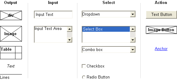
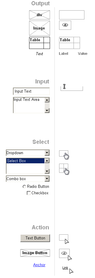
Each pattern contains one or more sets of well known interface controls. They are basic vocabulary of each pattern.
All graphical user interface patterns consist of a defined and well known vocabulary of so called ’user interface controls’. These basic controls provide building blocks each pattern consists of. They originally derive from graphical operating systems GUI Links and handed down to the world wide web as to interact with HTML pages[1]. The following sections show all commonly used controls of web applications.
Apart from desktop applications these ’user interface controls’ are implemented in web applications in numerous compositions. Interface Functionality can additionally be implemented by using different basic controls for the same purpose e.g. a button can be implemented as link (i.e. a element with href attribute) with a text label or an image/imagemap, an input element of type submit or a button element.
Originally the HTML element set has not been designed for the purpose of building applications. There’s a difference in using controls for static web pages and using controls for web applications. Many usability problems derive from problem of using controls for web applications in the same manner as for more static websites (links may trigger actions instead of switching between pages.
Common Types and recommended use[edit]
Output[edit]
- Text
In complex web applications the use of text is different compared to traditional, static web sites. Web sites are designed to display content, web applications use text additionally to:
- distinguish interface components (Labels)
- interact with the user (Dialogs)
- document the use (Help)
- display values
- Tables
Tables as HTML elements are not recommended anymore to organize the layout. Tables should only be used to list structured data.
Applied Elements:
- Images
In complex web applications the use of images is different compared to web sites:
- distinguish important/interactive interface components (Icons)
- interact with the user (Wait status)
- display values (Statistics)
Input[edit]
- Single Line Text InputThis type is used to take up short input. It should always have a label, with a description applied. The label is placed on top of the box, aligned left for fast perception.
- Multiple Line Text Input
Text areas are used to take up more text. A multiple line text input should have a label with a description applied. The label is placed on top of the box, aligned left to be scanned fast. To prevent users from typing on the last line, line padding should be applied.
References
Selection of predefined entities[edit]
- Single entity selection (1 of n)
- Radio buttons
Radio buttons are used to select exact one single entity out of a group of entities, while all possible options are usually shown to the user. Therefore radio buttons are used for a single selection out of a relatively small group of possible selections. Radio buttons can submit any selection after the choice is made or make use of additional submit mechanisms. - Drop Down Boxes
Drop Down Boxes are used to select exact one single entity out of a group of entities, while the possible options are only shown during the operation of the control. Therefore the frequent use of drop down boxes is not recommended, especially not for small numbers of possible selections. Drop down boxes can submit any selection after the choice is made or make use of additional submit mechanisms. The recommended kind of type depends on the use case. - Combo Boxes
They appear similar to the drop down. The combo box is different in the way that it allows to enter text on the first line.
- Multiple entity selection (m of n)
- Checkboxes
Checkboxes are used to select a specific number of entities out of a group of entities, while all possible options are usually shown to the user. Therefore checkboxes are usually used for selections out of a relatively small group of possible selections. checkboxes can submit any selection after the choice is made or make use of additional submit mechanisms. - List Boxes
List boxes can carry a large amount of options. More than one selection can be made by pressing the CTRL-Key. The list box is rarely used, because users have to change from mouse to keypad to press (and hold) the key.
Submit[edit]
- Hyperlinks
Users are already familiar with a different appearance of a link. So it doesn’t need to be blue and underlined. When hovering the browser specific mouse pointer must always be retained unchanged and never turned off. - Buttons
Buttons are widely accepted as a call for user interaction. A button is used to trigger application functionality, to submit user input and to accept or chancel dialogs/messages.
- All buttons should appear on one screen without the need of scrolling
- A standard button style is recommended
- Form and size of clickable areas should never be similar to banners (banner blindness)
- The button text must be meaningful according to the users terminology
- Buttons behave different from links (A link always leads to a different view, a button triggers an action)
Primary and secondary buttons should be distinguished. This primary button(s) is the one that triggers the expected action (OK, Confirm, Save), whereas the secondary button does not have an effect on any data (Cancel, Back, ...).
- Iconic Buttons
See ’Images’.
Classification of Patterns[edit]
All patterns are classified as following
- Organizing Layout and Display
- Navigating Functionality
- Display Data
- Navigating Data
- User Input
Documentation through Abstract Patterns[edit]
The abstract pattern is used to describe a unique coherent interfaces element with its functional fitting. It contains all building blocks important to style guide definition and interface development. All visual patterns are defined by a specific set of controls. A basic pattern consists of at least two controls. The abstract pattern describes which kind of element is recommended. A variety could be chosen in design, prototyping or development.
Compartment
It simply separates the pattern from other interface elements. This does not mean it defines a fixed size or position in the interface, it rather serves as boundary for a set of elements and claims a place in the interface be it persistent, dynamic or overlapping. If a pattern has a defined place it is documented.
Optional, non Persistent Element
Depends on privileges of the user role after log or other conditions which make the elements only optional.
Example of an Abstract Pattern[edit]
Simple Search Example (UI-SS Simple Search)[edit]
Three basic controls are used
- Label
Can be an image or output text - Text Input
- Form Button
The label can be an image or simply output text.
An overview of available patterns can be found here:


