Difference between revisions of "User Interface Components"
| Line 7: | Line 7: | ||
https://zim01.gwdg.de/repos/smc/trunk/04_Design/03_GUI_Design/03_interface_development/eSciDoc_Component_Library/ | https://zim01.gwdg.de/repos/smc/trunk/04_Design/03_GUI_Design/03_interface_development/eSciDoc_Component_Library/ | ||
=Integration of GUI components= | =Integration of GUI components= | ||
Revision as of 10:19, 19 March 2010
| APPLICATION AREAS |
|---|
|
|
| PROJECTS |
|
Research- and Metadata Handling Corporate & Interface Design (under Rework) |
| edit |
Development of Reference HTML[edit]
All eSciDoc interfaces should derive from a defined set of HTML reference components. The html-components are hosted here. As implementation is always a bit ahead they may not be in sync to the JSPs. This is also the place where an online pattern library will be forthcoming to offer access to third party development as well:
Integration of GUI components[edit]
The following documentation refers to the productive development environment (e.g.PubMan). The example /pubman_presentation/src/main/webapp/HomePage.jsp shows how CSS and JS is integrated:
<head>
<title><h:outputText value="#{ApplicationBean.appTitle}"/></title>
<link rel="sword" type="application/xml" title="Sword Servicedocument Location" href="#{ApplicationBean.pubmanInstanceUrl}/pubman/faces/sword-app/servicedocument"/>

<jsp:directive.include file="header/ui/StandardImports.jspf" />

<jsp:directive.include file="home/HomePageFeedLinks.jspf" />
</head>
The <head> section imports all CSS and JavaScript (jQuery) with <jsp:directive.include file="header/ui/StandardImports.jspf" />
<link href="../../cone/js/jquery.suggest.css" rel="stylesheet" type="text/css" />
<link href="./resources/eSciDoc_CSS_v2/main.css" type="text/css" rel="stylesheet"/>

...

<script type="text/javascript" language="JavaScript" src="resources/scripts.js">;</script>

<script src="./resources/eSciDoc_JavaScript/eSciDoc_javascript.js" language="JavaScript" type="text/javascript">;</script>
CSS and JS is hosted in the resource folder which has the following structure.
.
|-- eSciDoc_CSS_v2
|   |-- eSciDoc_component_css
|   |-- eSciDoc_global_css
|   `-- themes
|       |-- skin_PubMan
|       |   |-- images
|       |   `-- styles
|       |-- skin_classic
|       |   |-- images
|       |   `-- styles
|       `-- skin_highContrast
|           |-- images
|           `-- styles
For the CSS the first part is now explained: 'eSciDoc_CSS_v2'. We'll come to the JS part later.
CSS[edit]
Prerequisites[edit]
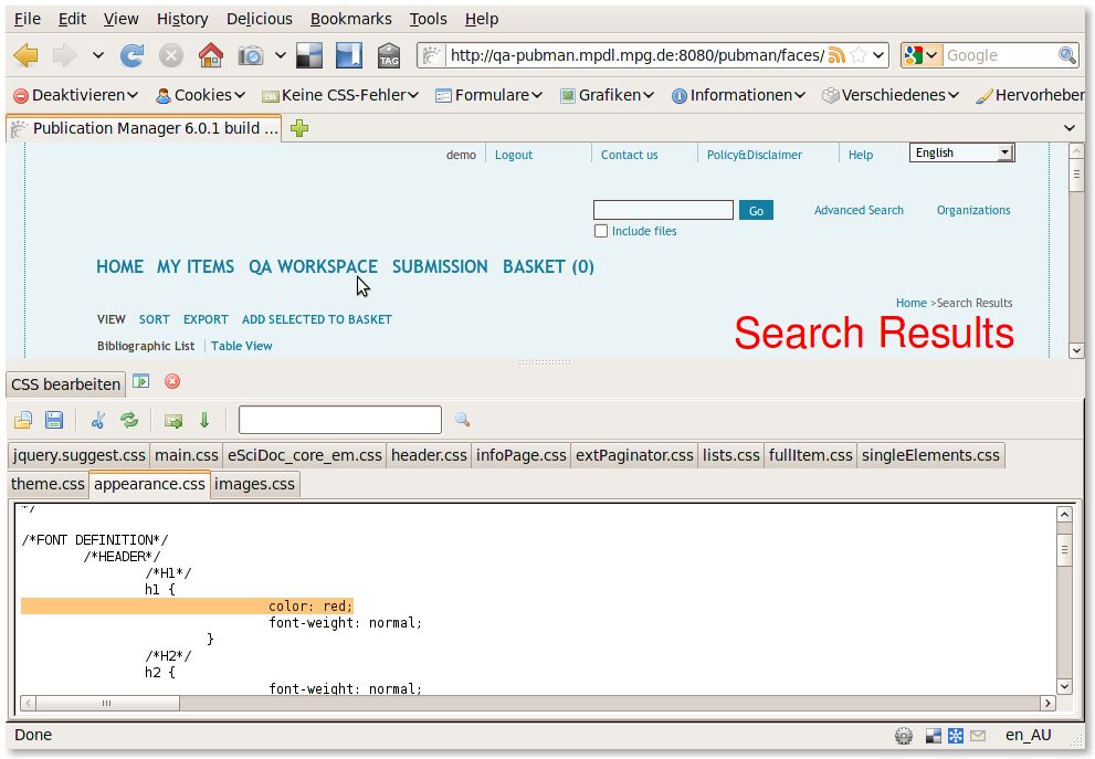
As we deal with a web application we can influence what has been loaded into the DOM directly. Especially for CSS manipulations in vitro it is recommended to use firefox plugins like 'Web Developer'.
There are a lot of examples and tutorials out there (youTube, ...). The most interesting fuctionality is to edit CSS directly:
CSS Files[edit]
<link href="./resources/eSciDoc_CSS_v2/main.css" type="text/css" rel="stylesheet"/>
The main.css is a preselector of all further CSS and calls the following files:
/* import eSciDoc global styles | globale eSciDoc-Stylesheets einbinden */
	/* import eSciDoc core | eSciDoc core einbinden */
		@import url(./eSciDoc_global_css/eSciDoc_core_em.css);

/* import component specific styles | komponentenspezifische Stylesheets einbinden */
	/* import header styles | das Stylesheet für den Seitenkopf einbinden */
		@import url(./eSciDoc_component_css/header.css);
	/* import info page styles | das Stylesheet für die Info Seiten einbinden */
		@import url(./eSciDoc_component_css/infoPage.css);
	/* import extended paginator component styles | das Stylesheet für die Komponente "erweiterter Paginator" einbinden */
		@import url(./eSciDoc_component_css/extPaginator.css);
	/* import list component styles | das Stylesheet für die Listenkomponenten einbinden */
		@import url(./eSciDoc_component_css/lists.css);
	/* import full item component styles | das Stylesheet für die Komponente für die Itemvollansicht einbinden */
		@import url(./eSciDoc_component_css/fullItem.css);
	/* import single elements styles | das Stylesheet für die einzelnen Elemente einbinden */
		@import url(./eSciDoc_component_css/singleElements.css);
eSciDoc_core_em.css
This contains all basic elements from which interface components are composed. It defines fixed sizes as a standard set and basic definitions of position and dimensions.
This example shows that elements first get a basic formatting and than a fixed size.
/*LABELS (base size-1px)*/
.free_label, .xTiny_label, .tiny_label, .xSmall_label, .small_label, .medium_label, .large_label, .xLarge_label, .double_label, .xDouble_label, .quad_label, .huge_label, .xHuge_label, .half_label, .full_label {
				padding-left: 0.09em;
				display: inline;
				overflow: hidden;
				margin: 0px;
				margin-right: 0.09em;
				white-space: nowrap;
				float: left;
			}

.xTiny_label {
				width: 1.28em;
			}
header.css
Refers to the persistent area above the dynamic content area. It prepares the stage menus, logo, search, title and breadcrumb. It is well commented and classes have a speaking name.
lists.css
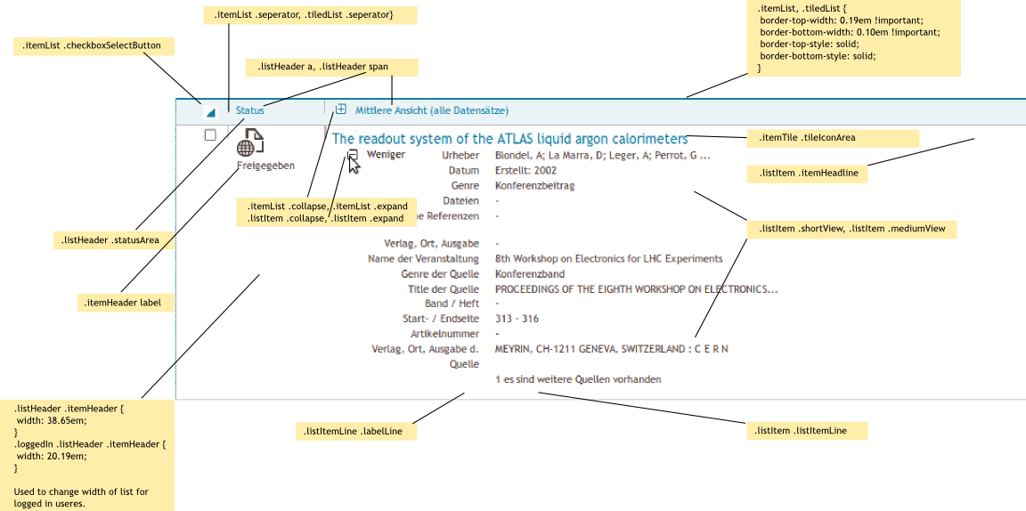
Item lists have their own css file which is also relevant for view and edit pages. List elements such as header and group labels are used commonly.
As there are two different lists (bibliographic, table). Both correspondent to semantics as far as possible. The bibliographic list is built with list elements whereas the table list is built with table elements. So basically all table related classes refer to the table list view which is not documented here explicitly.
.listItem td .itemHeadline {
	width: 28.01em;
	padding-bottom: 0.19em;
}

.loggedIn .listItem td .itemHeadline {
	width: 18.65em;
}

.listHeader th .itemHeadline {
	width: 28.01em;
}

.loggedIn .listHeader th .itemHeadline {
	width: 18.65em;
}
At the end of the lists.css there are additional attributes for print layout of lists because users often like to get those lists printed.
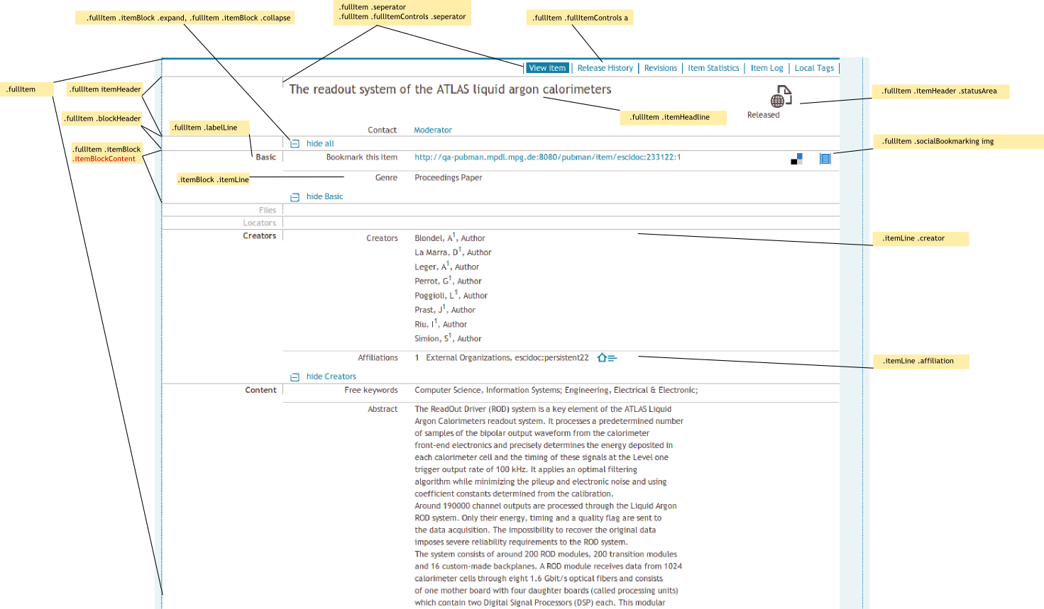
fullitem.css
@media print {

	.fullItem .fullItemControls {display: none;}
}
JavaScript[edit]
All CSS is invoked by the main CSS. It calles at first the core CSS framework:
Header Section Components[edit]
- Meta Menu
- Logo
- Search Menu
- Main Menu
Common Content Components[edit]
- Content Menu (Options, Actions)
- Breadcrumb
- Title
- Status
- Message (Optionally)
Content Components[edit]
- Paginator
- Grid List (Not R4.0)
- Bibliographic list (short and medium)
- Bibliographic list (simple)
- Wizard
- Edit Item
- View Item
Implementation of JSPF Structure[edit]
A JSPF is built upon one or more blocks of the Reference HTML. To prepare the JSPF structure a HTML component is separated in reusable snippets and nested into the JSPF.
JSPFs[edit]
- Application layout
- List Items
- View Item
- Edit Item
- ...
After a JSPF is prepared, UIE hands it over to Dev/Presentation for debug and implementation into the presentation layer. If implementation leads to a change of the intended appearance the JSPF needs to be fine tuned by UIE again.


