Difference between revisions of "Thinking Aloud for Digitized Books Interview Analysis"
| (40 intermediate revisions by 2 users not shown) | |||
| Line 1: | Line 1: | ||
{{Template:TemplateUIE_Activities}} | {{Template:TemplateUIE_Activities}} | ||
<div style="float:left; width:70%; margin-bottom:3em;"> | <div style="float:left; width:70%; margin-bottom:3em;"> | ||
| Line 29: | Line 30: | ||
==Working conditions== | ==Working conditions== | ||
Working conditions are quite well among all | Working conditions are quite well among all 13 Participants although there is some distraction and more urgent tasks need to be tackled while screen handling. This is a quite good rate compared to tests from 2008 and 2009 even if we partial the two MPDL staff members out. | ||
{| {{table}} | {| {{table}} | ||
| Line 77: | Line 78: | ||
==Experience with Screen Interfaces== | ==Experience with Screen Interfaces== | ||
Participants already do have a lot of experience. They are well experienced with web applications already. The rate is quite high compared to other institutes. | Participants already do have a lot of experience. They are well experienced with web applications already. The rate is quite high compared to other institutes. | ||
{| {{table}} | {| {{table}} | ||
| align="center" style="background:#f0f0f0;"|'''Percentage of Work spent with applications''' | | align="center" style="background:#f0f0f0;"|'''Percentage of Work spent with applications''' | ||
|'''Percentage of web applications involved''' | | align="center" style="background:#f0f0f0;"|'''Percentage of web applications involved''' | ||
|- | |- | ||
|88% | |88% | ||
| Line 107: | Line 107: | ||
== Non Functional Tasks == | == Non Functional Tasks == | ||
[[image:non_functional.gif|thumb|center|Analysis Result]] | |||
<div style="heigth:3em;"> | |||
These tasks are performed as a warm up only and are usually carried out fine. | |||
</div> | |||
== Browse & Display == | |||
[[image:browse_display.gif|frame|center|Analysis Result]] | |||
== | ===Summary=== | ||
* The filter dropdown is not recognized; participants focus on items in the list | |||
* Participants would have failed without filtering (there were only view items and the status was visible at the item) | |||
* Medium View was used rarely; Participants rather click on the title for detail view | |||
* Participants get stuck with numbers; Scan numbers and page numbers can not be distinguished; additional numbers in the dropdown (e.g. 123/56) and the filename (e.g. e00001) leads to confusion | |||
* The metadata section of structural elements can not be accessed by most users; participants keep their focus on the tree and do not search in the menu | |||
== View Item/Details == | |||
[[image:view_item.gif|frame|center|Analysis Result]] | |||
===Summary=== | |||
* breadcrumb is not used; either the back button is used or they start over from "Inhaltsverzeichnis" | |||
* participants hesitate quite long because most of them are in a different volume and the way up is not obvious | |||
* the way to the detail section of a structural element is still difficult even if it was found previously | |||
== Export and Miscellaneous == | == Export and Miscellaneous == | ||
[[image:export.gif| | [[image:export.gif|frame|center|Analysis Result]] | ||
[[image:misc.gif| | [[image:misc.gif|frame|center|Analysis Result]] | ||
===Summary=== | |||
* The maximum page size was not found by most users because participants didn't click on the image; most users searched in the menu or near the picture | |||
== Edit Book Meta Data == | == Edit Book Meta Data == | ||
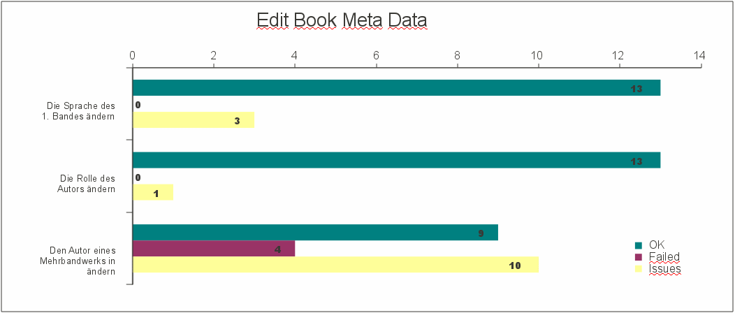
[[image:edit_book_md.gif| | [[image:edit_book_md.gif|frame|center|Analysis Result]] | ||
===Summary=== | |||
* half of the participants were not able to find the edit mode; especially when the menu was in a state where no edit was offered | |||
* participants especially had problems when moving back to browse and then to edit mode again | |||
* users were not aware of the view mode and edit mode at all | |||
== Edit Table of Content == | == Edit Table of Content == | ||
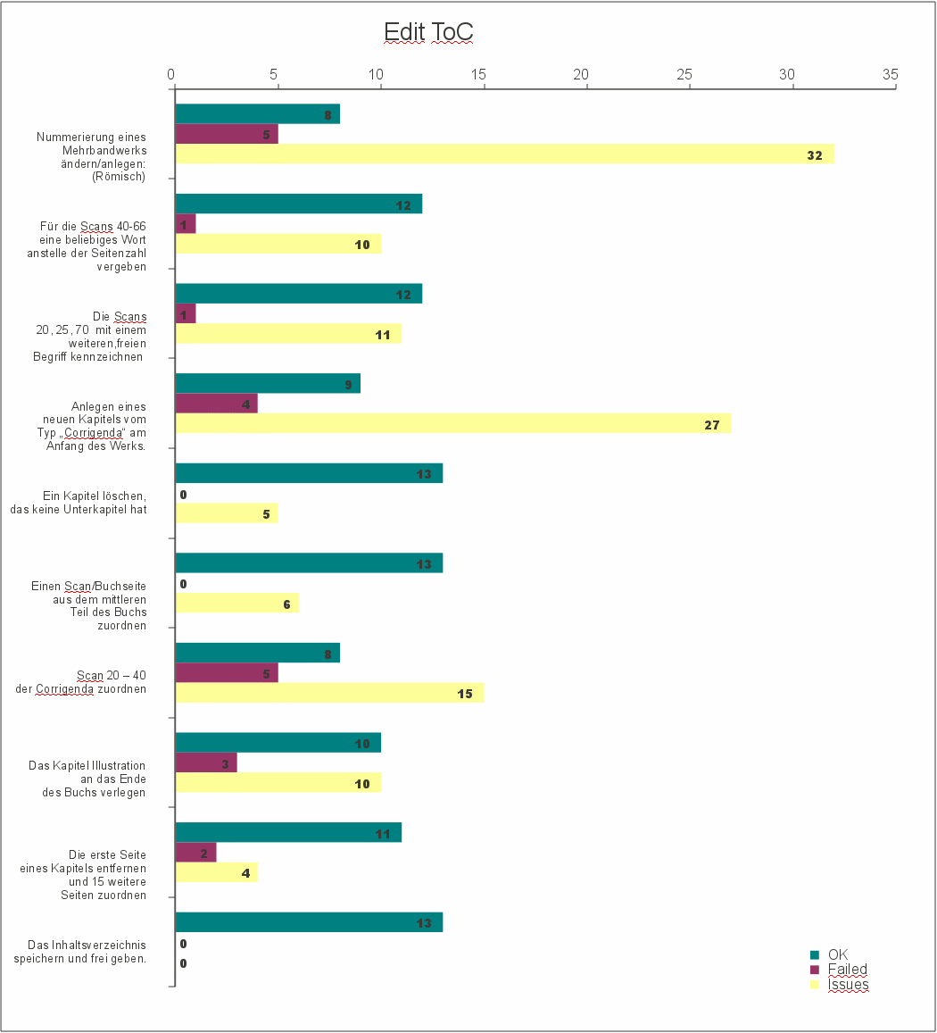
[[image:edit_toc.gif| | [[image:edit_toc.gif|frame|center|Analysis Result]] | ||
===Summary=== | |||
* the edit mode is still difficult to trigger even if it was successfully found before | |||
* users were not aware that filtering is done first, didn't see a reason for that because pages were already there | |||
* the filter was often mixed up with selection of pages | |||
* if the edit mode for a multivolume is triggered no volume could be selected anymore | |||
* it is not clear to users when a selection is stored | |||
* checkboxes are used manually; in almost all interviews the select-dropdown was not recognized | |||
* filter and selection relation not clear in all tests | |||
* if roman numbering is chosen users tend to fill in a roman number as start page | |||
* if selections are used from the select-dropdown users ignore the option "all on this page" and take "all" | |||
* messages are not recognized if roman start number causes an error | |||
* users can not distinguish between text input in the list directly and text input in the tools area above | |||
* the input of single pages is expected for the filter (1,5,n) | |||
* tree selections are not clear, tree doesn't keep it's position across pages | |||
* the hover is similar to an active element, tree often jumps after refresh, selections get difficult | |||
* the tree window changes place, users get unsure about the selection (is it lost or kept) | |||
* bug: if the root is selected, the structural element is created at the end | |||
* movement of elements in the tree is too slow | |||
* users do not get the detail menu point if meta data for a structural element should be changed | |||
* users often want to edit "in place" | |||
* assignment of pages to tree gets complicated because selection in the tree are not clear/tree jumps | |||
=Summary= | =Summary= | ||
| Line 145: | Line 189: | ||
</div> | </div> | ||
[[Category:User Interface | [[Category: User Interface Engineering]] | ||
Latest revision as of 08:14, 17 May 2011
| APPLICATION AREAS |
|---|
|
|
| PROJECTS |
|
Research- and Metadata Handling Corporate & Interface Design (under Rework) |
| edit |
Results from 'Thinking Aloud' interviews for ViRR Release 3[edit]
The usability evaluation method 'think aloud' is the most affordable and efficient among numerous test methods. If one follows human centred design principles to go for ISO 13407[1], it is good way to get relevant issues fast.
Participants[edit]
According to the main groups defined in Personas 2 + 11 Persons were interviewed. 2 Persons were interviewed at the MPDL in Munich and 11 at the MPIER in Frankfurt:
| Group | Amount |
| Administrator | 0 |
| Librarian | 7 |
| Scientist | 2 |
| Secretary | 4 |
| Guest | 0 |
| All | 13 |
Working conditions[edit]
Working conditions are quite well among all 13 Participants although there is some distraction and more urgent tasks need to be tackled while screen handling. This is a quite good rate compared to tests from 2008 and 2009 even if we partial the two MPDL staff members out.
| Desktop space | Rating |
| Lot of space | 13 |
| Good | 0 |
| Crowded | 0 |
| External Help | Rating |
| Available | 13 |
| IT Services | 0 |
| Poor | 0 |
| Noise and distraction | Rating |
| Distraction | 0 |
| Little | 4 |
| None | 7 |
| Urgency of task | Rating |
| Lower | 5 |
| Average | 6 |
| Higher | 2 |
Experience with Screen Interfaces[edit]
Participants already do have a lot of experience. They are well experienced with web applications already. The rate is quite high compared to other institutes.
| Percentage of Work spent with applications | Percentage of web applications involved |
| 88% | 57% |
Terms and definitions[edit]
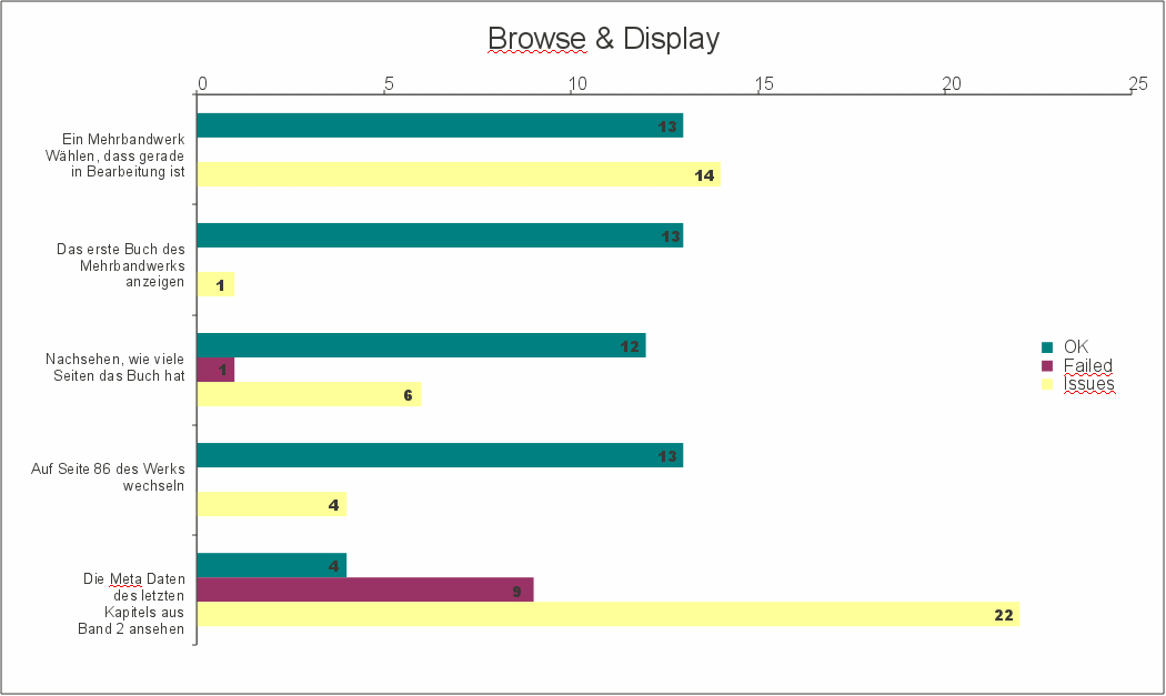
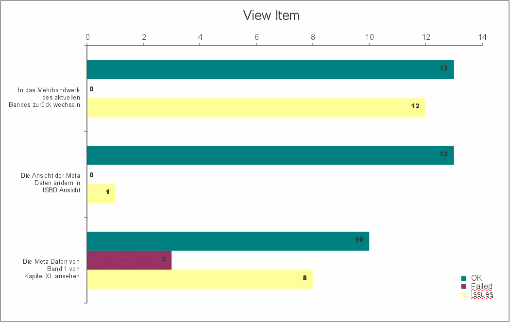
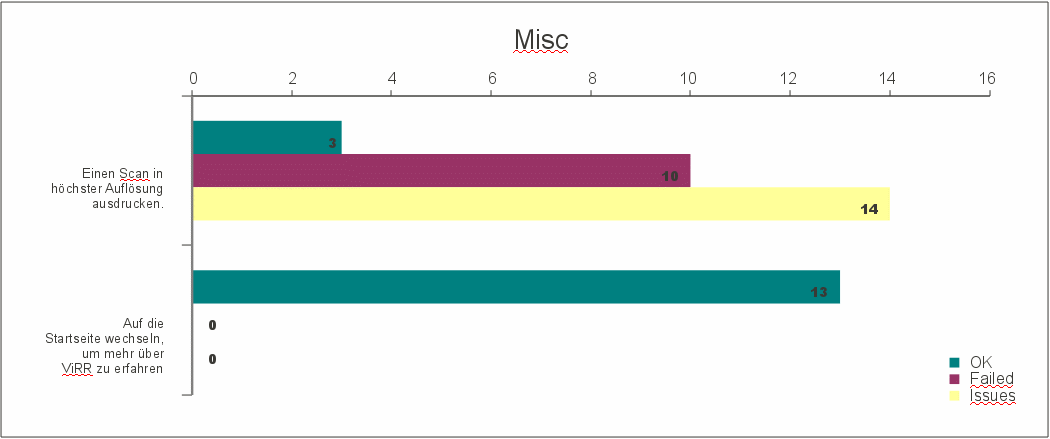
Issues
Indicate where users were hesitating, asking, put a comment or missed the right action at the first attempt. (A hint for User Interface Engineering where problems exist and if they can be related to wording, process or position). Issues are rated as Minor, Serious or Failed but do not count as 'failed' or 'ok'. They only provide hints to the interface engineering team how to judge severity of issues.
Failed
The task couldn't be completed with the interface. This is the case when users get lost within the interface, do something wrong or can not continue because something is missing.
OK
The task leads to a valid result. This is the case when no step shows a single 'Failed'. It does not mean that single steps can have issues of type serious or minor.
Analysis[edit]
Non Functional Tasks[edit]
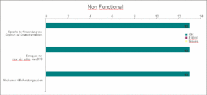
These tasks are performed as a warm up only and are usually carried out fine.
Browse & Display[edit]
Summary[edit]
- The filter dropdown is not recognized; participants focus on items in the list
- Participants would have failed without filtering (there were only view items and the status was visible at the item)
- Medium View was used rarely; Participants rather click on the title for detail view
- Participants get stuck with numbers; Scan numbers and page numbers can not be distinguished; additional numbers in the dropdown (e.g. 123/56) and the filename (e.g. e00001) leads to confusion
- The metadata section of structural elements can not be accessed by most users; participants keep their focus on the tree and do not search in the menu
View Item/Details[edit]
Summary[edit]
- breadcrumb is not used; either the back button is used or they start over from "Inhaltsverzeichnis"
- participants hesitate quite long because most of them are in a different volume and the way up is not obvious
- the way to the detail section of a structural element is still difficult even if it was found previously
Export and Miscellaneous[edit]
Summary[edit]
- The maximum page size was not found by most users because participants didn't click on the image; most users searched in the menu or near the picture
Edit Book Meta Data[edit]
Summary[edit]
- half of the participants were not able to find the edit mode; especially when the menu was in a state where no edit was offered
- participants especially had problems when moving back to browse and then to edit mode again
- users were not aware of the view mode and edit mode at all
Edit Table of Content[edit]
Summary[edit]
- the edit mode is still difficult to trigger even if it was successfully found before
- users were not aware that filtering is done first, didn't see a reason for that because pages were already there
- the filter was often mixed up with selection of pages
- if the edit mode for a multivolume is triggered no volume could be selected anymore
- it is not clear to users when a selection is stored
- checkboxes are used manually; in almost all interviews the select-dropdown was not recognized
- filter and selection relation not clear in all tests
- if roman numbering is chosen users tend to fill in a roman number as start page
- if selections are used from the select-dropdown users ignore the option "all on this page" and take "all"
- messages are not recognized if roman start number causes an error
- users can not distinguish between text input in the list directly and text input in the tools area above
- the input of single pages is expected for the filter (1,5,n)
- tree selections are not clear, tree doesn't keep it's position across pages
- the hover is similar to an active element, tree often jumps after refresh, selections get difficult
- the tree window changes place, users get unsure about the selection (is it lost or kept)
- bug: if the root is selected, the structural element is created at the end
- movement of elements in the tree is too slow
- users do not get the detail menu point if meta data for a structural element should be changed
- users often want to edit "in place"
- assignment of pages to tree gets complicated because selection in the tree are not clear/tree jumps
Summary[edit]
Measures taken from interviews do not lead necesserily to a solution of the problem in one go. Old issues need to be tested again. As R4 comes with a new interface it needs to be tested completely.
