Difference between revisions of "User Interface Evaluation/Thinking Aloud/Interview Analysis"
Jump to navigation
Jump to search
m (New page: {{Template:TemplateUIE_Activities}} <div style="float:left; width:70%; margin-bottom:3em;"> =Results from 'Thinking Aloud' interviews based on R2= The usability evaluation method 'think ...) |
m (→Summary) |
||
| Line 21: | Line 21: | ||
=Summary= | =Summary= | ||
The following issues | The following issues are identified | ||
*Screen jumps on every action to top -> Technical Issue | *Screen jumps on every action to top -> Technical Issue | ||
Revision as of 10:21, 3 January 2011
| APPLICATION AREAS |
|---|
|
|
| PROJECTS |
|
Research- and Metadata Handling Corporate & Interface Design (under Rework) |
| edit |
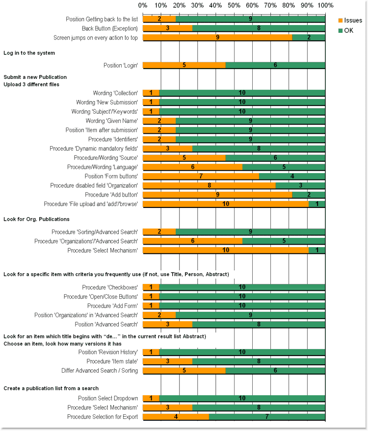
Results from 'Thinking Aloud' interviews based on R2[edit]
The usability evaluation method 'think aloud'[1] is the most affordable and efficient among numerous test methods. If one follows human centred design principles to go for ISO 13407[2], it is good way to get relevant issues fast.
11 Persons were interviewed out of 3 domains:
- Scientists (5 Interviews)
- Librarians (4 Interviews)
- Secretaries (2 Interviews)
This is the first result across three person groups. To get a closer picture for one group at least 7 Interviews need to be taken.
The test documents containing all relevant tasks and notes from the interviews can be found here:
Summary[edit]
The following issues are identified
- Screen jumps on every action to top -> Technical Issue
- Procedure/Wording 'Language' -> Technical/Functional Issue
- Position 'Form buttons' -> GUI Issue
- Procedure 'Add button' -> GUI Issue
- Procedure 'File upload and 'add'/'browse' -> GUI Issue
- Procedure 'Organizations'/'Advanced Search' -> GUI Issue
- Procedure 'Select Mechanism' -> GUI Issue
